From visitors to clients: increase site conversion with design

Website conversion is commonly understood as the ratio of visitors who perform the desired action on a website—such as ordering a product—to the number of visitors in total.
Does your website design affect conversion rates? What exactly on your site will convince a visitor to place an order or contact you for a service? On the flip side, is there a reason that a visitor left your site without even scrolling down?
Read this article and learn the subtleties of web design that can help you significantly improve the appeal and conversion rate of your site.
A beautiful design doesn't make an effective design
A good designer will create a site that clearly markets the product or service to potential buyers. It will make their lives easier, offering them a solution rather than a problem. Don't be worried about lacking creativity, as some of the best designs are ones that are proven reliable.
Now let’s look at some of the criteria requirements for a competent design. If you already have a website you can follow along and see how it stacks up. If your site has been suffering from low sales or page traffic it’s possible this list may alert you to potential causes.
Don’t forget the mobile version
The SEO impact of a mobile website is obvious. First of all, your main aim is to generate traffic. Search engines consistently report an increasing number of people browsing sites from their mobiles. Entertainment sites and marketplaces, in particular, are frequently visited by smartphone users. Thus, creating a mobile version opens your site up to a much larger audience.
Mobile sites are also important in terms of rankings. Search engines offer higher rankings to sites that are easily readable from both a desktop or a mobile device. This is true with both Yandex and Google, which have officially confirmed that their priority is the mobile index. If a site does not have a well-designed and working mobile version, it will be ranked lower.
Make your site as user-friendly as possible
Form a clear hierarchy
This is one of the most important criteria points. You need to know how you want to prioritize and organize your content before proceeding with the design. It is more difficult to change the hierarchy of your site when it exists, so it’s better to prioritize and map the user flow from the start. If you don’t, you will have to resort to redesigning in an effort to redirect users' attention and increase conversions.
If a site is confusing, a visitor will leave. You want to format your design in such a way that the potential client can distinguish what is important from what is not. This can be done using size, brightness, or even adding animation. A visual representation of the page should answer the questions:
What is it?
How can I use this?
Why do I need it?
The right hierarchy is also needed to simplify the search process. When a site contains a large amount of information, it makes sense to break it down into broad categories and subcategories. As a result, different hierarchical levels are formed which makes the site easier to navigate.
Categorize your content in a way that forms a logical hierarchy for your users, and link these pages vertically. Use cross-links to link pages that are in different categories but have something in common. First, make navigation easy for users, then optimize it for search engines (without sacrificing user experience). Make sure to test all possible user scenarios on your page, as this will help improve site navigation and make sure all required elements are present.
Use clear navigation
Pin the navigation bar to the top of the site and don't place a lot of links on it. Instead, it’s recommended to place all links to aside info pages in the footer. You should always ensure secondary links open in a new tab, rather than replacing your site. Place a link to the homepage on the logo and add location points. You can also display the user’s progress in terms of loading and scrolling. Don’t forget to add a “scroll back to top” navigation button if necessary!
Provide simple web forms
Keep it as minimal and simple as possible, no matter what type of web form you are using. This also applies to web form elements such as title, characteristics, and buttons. Place forms away from other elements on the page. As people often shift their attention, such a technique will allow them to quickly input their information and help you gain positive results.
Create clear, visible calls
Help potential clients make a decision. Highlight important buttons using color, and place them where lines intersect to form "points of force".
Apart from your page title, the text on a button is one of the few that will be read by visitors. Pay attention when drafting text, and remember to keep it clear and concise.
Use space correctly
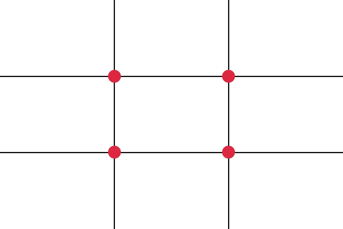
The rule of thirds
Visually divide the space into three parts both horizontally and vertically, using two lines. The intersections of these lines are the “power points”, which will get the most attention. Place important page elements on these intersections.
Negative space
Negative space is the space between large and small site elements. It includes the space between letters, lines, and design elements. Negative space is used to focus the user's attention on what is important, giving them the information you wish to impart. Negative space helps to streamline designs and visually differentiate elements.
You should take into account the following tips:
when using a smaller font, create more space between letters
divide large blocks of text into several small ones for easier reading
separate large site elements with wide margins and padding
Use attention distribution heatmaps and place site objects according to red spots. A heatmap is meant to judge how easy a site is to navigate, whether advertising banners have been installed correctly, which elements are attracting attention, and how users search for information. Whether you choose to use heatmaps or not, the important thing is to avoid overloading the design. Focus only on what is most important.
Use the F-model
Usability specialist Jakob Nielsen researched thousands of sites and calculated that a user perceives the text according to the F-model. Users read the horizontal text first, usually across the top of the content area. This starter element forms the top strip of the F.
After that, a user will move slightly further down the page and again read in a horizontal motion though for a shorter duration than the initial read. This step forms the bottom strip of the F.
Finally, users scan the left side of the content vertically.
Some important points to note: the majority of a users’ attention falls on the first few lines of text, as well as the first few words to the vertical left. Try to place the most important information in these areas..png)
Know your audience
Understand you cannot please everyone. By trying to satisfy the masses you only run the risk of increasing your marketing costs and getting low website conversions.
Learn customers: their interests, habits, desires, and fears. Focus on what is most important, evoke the necessary emotions, use the appropriate color scheme, and set up a convenient interface. As a result, the user will feel comfortable, meaning it is more likely they will purchase a particular product or service.
If your target audience is under the age of 25, aim to create a vivid, dynamic design, and make sure to add animations and graphics. For older audiences, such as those aged 35-45, these effects can be annoying, and it’s best to avoid them. Stick with neutral tones and a classic conservative style if this is what your target audience is used to. Do the same if you are offering complex products and/or targeting a specialized industry or specific B2B segment.
Keep your focus on your target market, and design with this in mind. Create a website design that makes your product or service clear, in addition to being compatible with the preferences of your target audience.
Don’t forget to use real photos to build trust with your users. According to a Bright Local study, 23% of customers are more likely to contact a company that shows the faces of its employees. People are interested in people, and they want to see live photos, real stories, and results. The world market is oversaturated, meaning customers must be selective.
Make sure to have emotive photos on your site, adding text to accentuate meaning.
Test and do it right
We recommend the use of A/B testing. The idea behind A/B testing is to show different page variations to your website visitors. One segment will see one variation, and the other the next. This enables you to compare both and see which is getting the most conversions. Before starting the test, define the specific aspects of the site you wish to compare: for example revenue, transactions, goals, session duration, bounces, and page views. Create a variation based on a click or scroll heatmap and test things such as buttons, headers, images, and forms.
Test one hypothesis at a time.
After the end of the test, check the significance of the results obtained.
If A/B testing is too expensive for your budget, there is an alternative option. You can simply analyze 10-15 of the best convertible website designs in terms of your competitors. Be sure to thoroughly check all details of their site, even minor ones, in order to achieve the best outcome.
As you can see, the basic principles of a good design are all interconnected. Without proper hierarchy and prioritization, it is impossible to highlight and emphasize your focus point. If you are not careful your site can easily become uncomprehensive and unnavigable.
TAKEAWAY
Web design is a complex art and works best when created wisely and with your end-users in mind. You only have eight seconds to grab a user’s attention with your site—use those seconds wisely!